
When analyzing business performance data, leaders often face a critical question: Is this variation normal, or does it signal a real problem? A sales dip could be due to seasonal noise or the beginning of a decline. A spike in customer complaints might be random or indicate a systemic issue. Data accuracy in forecasting relies on understanding normal variations versus actual deviations. Understanding the Bell Curve helps distinguish between signal and noise and improves decisions when outcomes are uncertain.
The Bell Curve is a visual representation of how outcomes are distributed around an average. It is a graphical representation of a normal probability distribution. By modeling how outcomes are distributed, it helps estimate the likelihood of specific results based on observed data.
Understanding Normal Distribution
Consider measuring IQ scores across a large population. Testing everyone on earth would be impossible, but because IQ scores tend to be normally distributed across large populations, we would expect them to form a symmetrical distribution around the mean.
Researchers can therefore test a representative sample and use those results to predict the distribution of IQ scores across the entire population with reasonable accuracy.
This is the power of understanding normal distribution. To visualize how this works, we use a Bell Curve.
What is a Bell Curve
Statisticians represent this kind of normal variation with a Bell Curve, so named because its shape resembles a bell, a simple but powerful way to show how outcomes cluster around an average. Its graphical interpretation assumes a predictable spread of outcomes and is the most common type of data distribution.
Below is a graph of an IQ Bell Curve.
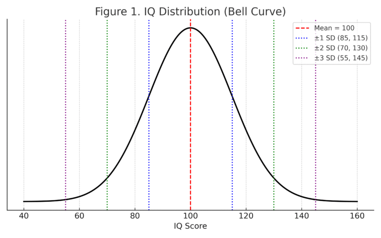
Figure 1. IQ Distribution
The Bell Curve has two primary metrics: the mean and the standard deviation.
The mean represents the average outcome and, in a normal distribution, also corresponds to the most probable outcome. All other occurrences fall equally on each side, creating downward-sloping lines.
In Figure 1 above, the mean IQ score is 100. The standard deviation measures how dispersed observations are around the mean.
Bell Curve Standard Deviations
Large deviations indicate wide variability, while small deviations suggest values cluster more tightly.
In Figure 2 below, the left diagram shows a large standard deviation, where values are spread far from the mean. The diagram on the right shows a small standard deviation, where values are concentrated near the mean.
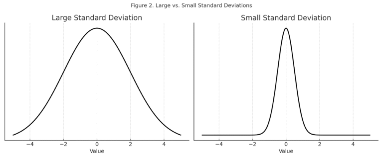
Figure 2. Standard Deviations.
From a probabilistic point of view, standard deviations also measure how rare or likely an observation is. In our IQ example, the mean score is 100, and each standard deviation represents 15 points. Most people fall close to the average, while scores above 130 or below 70 are uncommon. The same pattern shows up in business data. For example, in sales performance, most representatives cluster near the average quota attainment. A sales representative three standard deviations above the mean is not just slightly better, but a clear outlier.
Moving one standard deviation from the mean (85–115) includes about 68% of the population. Two standard deviations (70–130) cover approximately 95.4%. Three standard deviations (55–145) include about 99.7%, meaning almost all observations fall within this range.
The farther from the mean, the fewer observations exist. For example, an IQ of 160 is 60 points above the mean. Dividing by 15 points per standard deviation shows this result is four standard deviations away, a highly unusual outcome.
Bell Curve Percentages
The percentages associated with each standard deviation show how observations are distributed around the mean:
One standard deviation from the mean (85–115) includes about 68.2% of the population. Most people fall within this range.
The second standard deviation (70–130) adds another 27.2%, bringing the total to about 95.4% of the population.
The third standard deviation (55–145) accounts for only 4.3%, bringing the total to approximately 99.7% of the population. Almost all. This illustrates how uncommon observations become as they move farther from the mean and how rare they are outside this range.
If we know the mean, the standard deviation, and the value of an observation, we can determine how many standard deviations it lies from the mean and estimate how likely it is to occur.
Applications
IQ scores are just an illustrative example. The same framework applies in finance, operations, quality control, and forecasting. Leaders use Bell Curves to assess whether changes in sales, costs, or performance are part of normal variability or an indicator of risk and opportunity.
Consider a regional sales manager reviewing monthly revenue figures. One territory came in 40% below its average for the month. The instinct may be to act immediately by calling the sales representative, restructuring the territory, or escalating the issue to leadership. But before doing any of that, the Bell Curve suggests a more disciplined question: How far from the mean is this result, and how often would a deviation this large occur by chance?
If the territory’s historical results show high variability, a 40% decline may fall within two standard deviations and represent normal fluctuation. If performance is typically clustered tightly around the mean, the same decline could fall three standard deviations from the mean and signal that something has fundamentally changed.
The number alone does not determine the response. The distribution does.
While some phenomena follow asymmetrical or skewed distributions, a normal distribution provides a useful framework for analyzing many business metrics and distinguishing meaningful signals from random variation.
When data is skewed or does not follow a normal distribution, the Bell Curve loses its predictive accuracy. A leader who applies Bell Curve thinking indiscriminately will draw the wrong conclusions just as easily as one who ignores it entirely.
Revenue data, for example, often skews right because a small number of unusually large transactions can pull the mean significantly higher than the median. In those cases, pairing Bell Curve analysis with median-based measures and other statistical tools produces a clearer picture. The key is knowing when the normal distribution assumption holds and when it does not.
Understanding the mean and standard deviation enables leaders to assess the likelihood of events, determine whether they are observing ordinary fluctuations or a signal that warrants action, and make more informed decisions.